Hello, I’m Jeremy DeVos, a UX designer based out of Grand Rapids, MI. I specialize in graphic design and user research.
Rider App
MY ROLE:
UX DESIGNER
DURATION:
8 WEEKS

PROJECT OVERVIEW
Client Needs: A midwestern city was expanding their bus services and this was leading to issues with the bus system that had become large and unwieldly.
Solution: A robust tracking app was to be created in order to let their users know when a bus was arriving at their preferred bus stop.
Client
Gainesville Township
Year
3/01/2023
Audience
City Bus Route Riders
Team Mates
Thinkful Support Team
My Contributions
User Research, Wireframing, Usability Testing
Impact
1. Created a Multifunctional Bus Tracking App Satisfied User Needs
2. Discovered User Trends Through Surveys, Interviews, and Tests
Research and Analysis
Research Methods Used: Persona Development, Competitive analysis, User Surveys, User Interviews
Research Period: 4 Weeks
Competitive Analysis
-
Google Maps
Strengths: Public knowledge, accessible, standard
Weaknesses: Bland, not tailored to certain areas, minimum functionality
Oppportunities: Make a more focused app with a stronger design

-
Transit Stop App
Strengths: Accurate focused info on Chicago’s public transit options
Weaknesses: Only works in Chicago, visually unappealing, accessiblity issues
Opportunities: Stronger design options

-
Citymapper
Strengths: Strong design fundamentals, pedestrian trip planner, strong branding
Weaknesses: Only focused on major cities, no specific bus tracker
Opportunities: Carry over featues with focus on unserved client city


User Personas
-

George Mason
Age 26 - Claims Adjuster
-

Melinda Babbit
Age 32 - Consultant
-

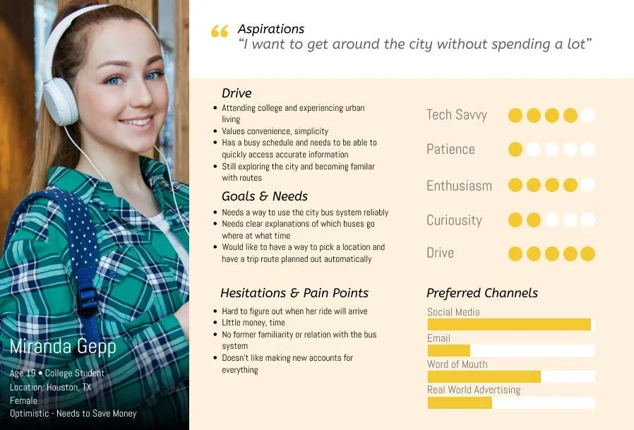
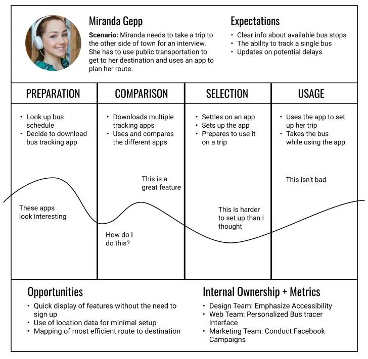
Miranda Gepp
Age 19 - College Student
-

Mark Jansen
Age 37 - Marketing
Persona Development: 4 Different personas based on the types of people most likely to use public transport options
Key Motivations: Efficiency, saving money, helping environment
Key Frustrations: Keeping bus schedules, tracking bus positions
Pain Points: Time commitment, navigation difficulties
The personas zeroed in on some traits that were common across all user groups. People who use the bus system are typically lower income or need to save money due to their circumstances. Some users prefer public transport because they are environmentally conscious. Of course, all users were time sensitive and wanted the shortest and most convenient trip possible.

User Stories
During the development of the personas, I created user stories to address the most important points that the app needed to address.
As a new user, I want to sign up so I can use the app.
As a new user, I want to know about all of the available routes so I know what I can access with the bus system.
As a new user, I need to know what specific bus is arriving so I know how much time I have to get to it.
As a new user, I need to know when a specific bus is arriving so I can catch it.
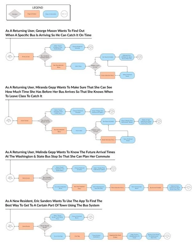
User Flows
Working with the app design, I created user flows to map out how to best create the app experience.
Work on the wireframes began after initial research was completed. The design had to quickly and effectively convey information for users that were in a hurry to catch their bus.
Wireframes & Prototypes
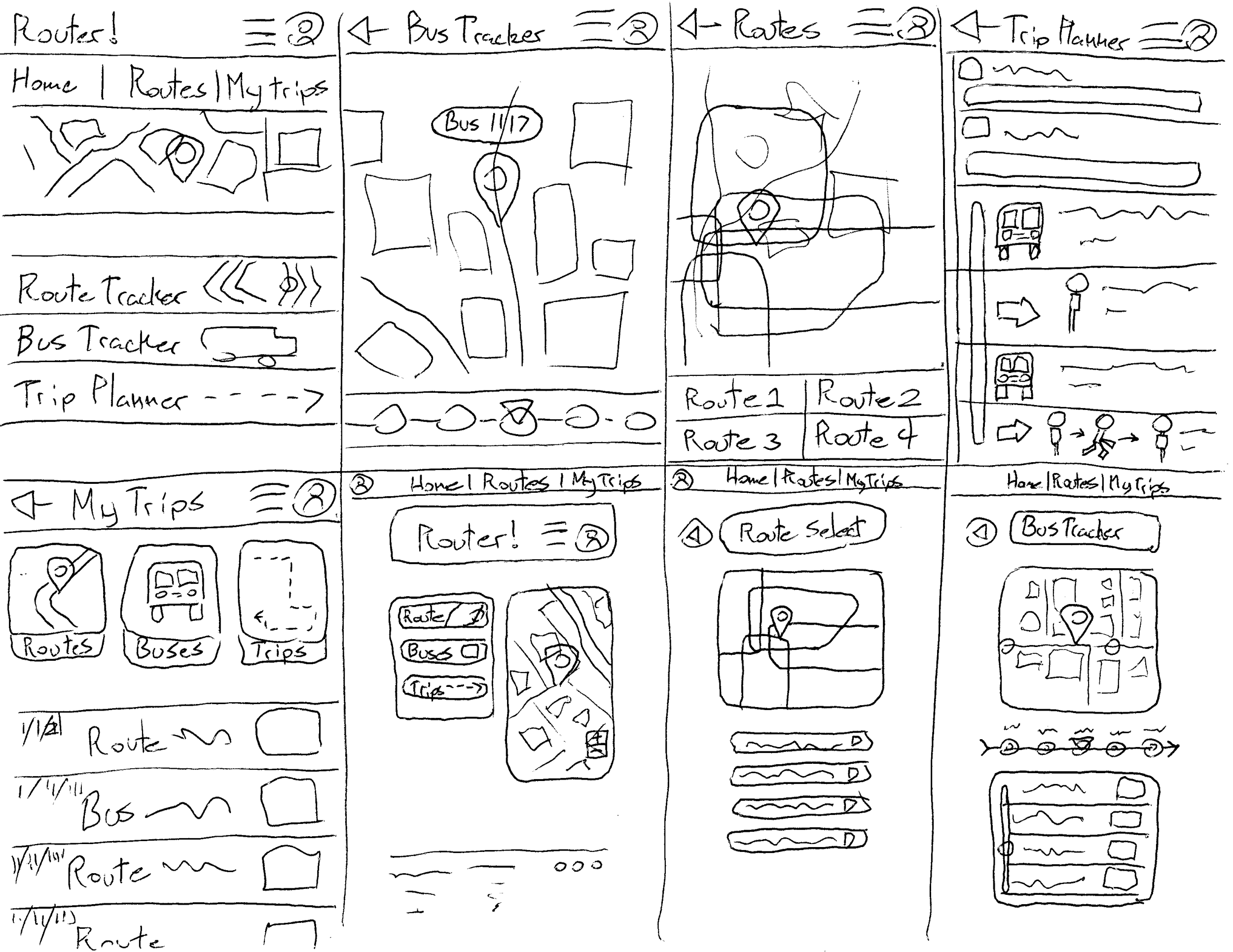
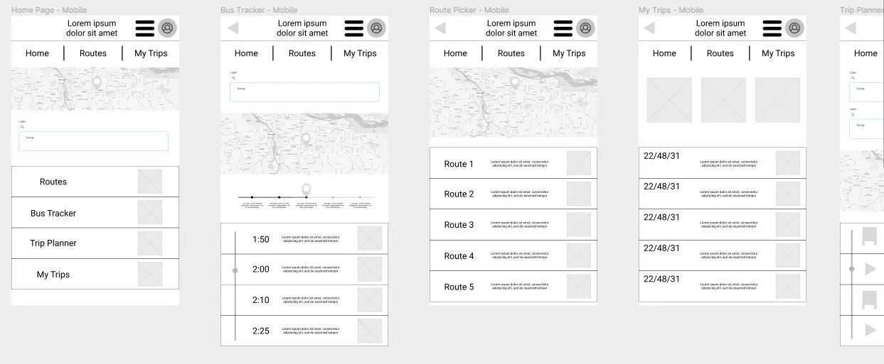
The sketches and wireframes started after the design fundamentals have been hashed out. Sketches proceeded smoothly and this is where I completely abandoned the idea of having a no-login usage along with alarms and/or reminders that buses were going to arrive soon. This was my first time using the figma platform to make a design at this scale so it worked well as a learning experience.
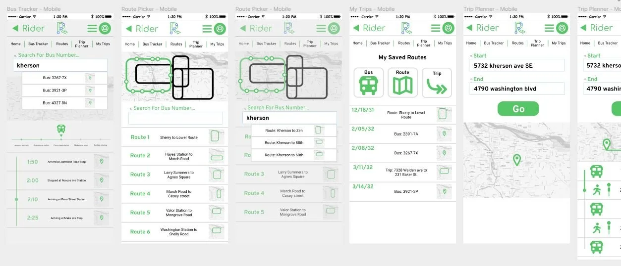
I laid out the pages and features in order to see what would work. This is where I decided to add a featue to plan a trip using public transport and built the design around a mixture of google maps and citymapper’s design decisions.
The sketches and wireframes started after the design fundamentals have been hashed out. Sketches proceeded smoothly and this is where I completely abandoned the idea of having a no-login usage along with alarms and/or reminders that buses were going to arrive soon. This was my first time using the figma platform to make a design at this scale so it worked well as a learning experience.
The prototype phase was another thing that I was not familiar with until I started it. I added as many redundancies as I could but my inexperience lead to issues down that line that were exposed during the usability tests.
CONCLUSION
The Client Was Satisfied with the functionality of the app and the features for tracking the bus arrival times at certain routes. The client accepted the added trip planner feature as a way to help users familiarize themselves with the city bus system.
The Users Were Satisfied With the functionality, look, and feel of the app. The majority of the users liked the added features and ease of use of the app.
Challenges During the Design Phase Included preconceived notions that had to be challenged through user interview and research. The prototype design phase was very rough because unclear commands sent users running in circles.
The App Was Successful Due to adherence to the fundamental principles of UX research and design. Research into user needs and competitor solutions laid the groundwork for an effective UI design and functionality.


